HTML/CSS 2
Teaching this lesson?
Read the Mentors Notes here
What will we learn today?
- Responsive web design
- Media queries
- Flexbox
- (Optional) Content layout: floats
- (Optional) Content layout: relative and absolute positioning
Learning Objectives
Learning objectives for this lesson can be found here
Responsive Web Design
When we build for the web, we're making websites that can be viewed in a phone, a laptop, a tablet and more. To ensure we're presenting a website that's easy to use on any device, we use Responsive Web Design techniques to modify how content is displayed depending on the viewport.
Exercise: As a group, let's brainstorm as many devices as we can think of which might access the websites we build.
See how much variety there is in viewport sizes.
Media Queries
As you learned in your homework assignment, media queries help us change the display of our content depending on the size of the viewport. Let's review what you learned and break down a media query:
@media screen and (min-width: 900px) {
  body {
    background: red;
  }
}
In this media query, we're assigning a red background color to the <body> element whenever the viewport is larger than 900px, and we're viewing on a screen.
@mediastarts the media queryscreentells it to apply these styles to screen displays. Other displays might beprint, for when a webpage is being printed.(min-width: 900px)tells it to apply these styles when the viewport is larger than900px
Finally, we wrap all of our styles for this media query in brackets ({ and }), just like a CSS rule.
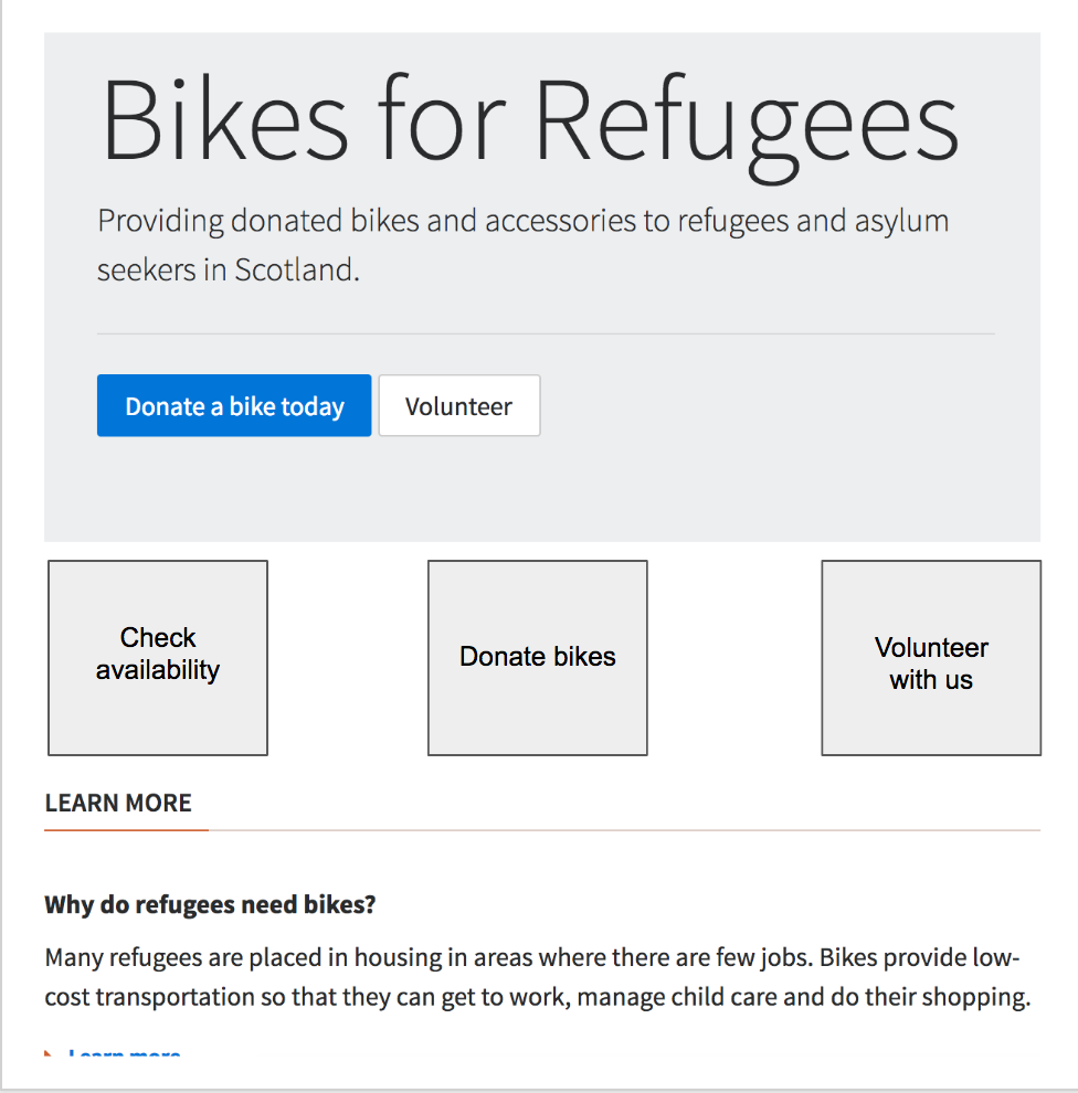
Exercise: Working in pairs, reduce the size of the "Bikes for Refugees" text so that it fits on a small screen (
320px). But make sure it increases in size on larger screens.Exercise: The two buttons in the jumbotron don't fit on the same line on small screens around
320pxwide. Can you adjust their size so that they fit on the same line?
Flexbox
Flexbox is a name for a set of CSS layout rules which are supported in newer browsers. They allow you to apply rules to elements to place them side-by-side and re-arrange them. You just specify how you want your elements arranged and the browser will scale this arrangement depending on the screen size and device used for viewing.
Most flexbox rules are applied to the container, to tell it how to arrange its children. However, there are some rules that can be applied to children as well.
You can see all the rules that can be applied to both the container and the children here: https://css-tricks.com/snippets/css/a-guide-to-flexbox/
Exercise: Continue editing the "Bike for refugees" website by adding 3 boxes below Jumbotron, and using Flexbox, make sure they are arranged like in the sketch below:
You can start with something like the below, by just adding a container, and the 3 text pieces within it. Try to use flexbox to position the text elements within the container to match the picture:
<div>
  <!-- CONTAINER START -->
  <div>Check availability</div>
  <div>Donate bikes</div>
  <div>Volunteer with us</div>
</div>
<!-- CONTAINER END -->
Once that's done you can move on to creating boxes for each individual text piece, and again, using flexbox to position the text piece in the middle of its box.
Let's take a break from flexbox for a minute. Do you remember the :first-child psuedo class? There's a :last-child psuedo class as well.
Exercise: See if you can use these psuedo classes to give the left box a grey background (
#ddd) and the right box a grey border (1px solid #ddd). Use this screenshot to guide you.
Homework
You can find the homework for this week here
Prepare for the next class
- (Est. 1 hour) You may remember Bootstrap from your application process. Look at the documentation for Bootstrap 4 and look at their examples to see how they are building components.

