HTML/CSS 2
What will we learn today?
Responsive Web Design
When we build for the web, we're making websites that can be viewed in a phone, a laptop, a tablet and many other devices. To ensure we're presenting a website that's easy to use on any device, we use Responsive Web Design techniques to modify how content is displayed depending on the viewport.
Exercise: As a group, let's brainstorm as many devices as we can think of which might access the websites we build.
See how much variety there is in viewport sizes.
Media Queries
As you learned in your homework assignment, media queries help us change the display of our content depending on the size of the viewport. Let's review what you learned and break down a media query:
@media screen and (min-width: 900px) {
  body {
    background: red;
  }
}
In this media query, we're assigning a red background color to the <body> element whenever the viewport is larger than 900px, and we're viewing on a screen.
@mediastarts the media queryscreentells it to apply these styles to screen displays. Other displays might beprint, for when a webpage is being printed.(min-width: 900px)tells it to apply these styles when the viewport is larger than900px
Finally, we wrap all of our styles for this media query in the brackets { and }, just like a CSS rule.
Complete exercise 10 from the exercise project.
Flexbox
Flexbox allows you to arrange things on a webpage. These can be buttons, <div> elements, paragraphs, anything you want!
To add flexbox:
- Identify the elements you want to arrange in a certain way. Let's use this for now:
  <button>Home</button>
  <button>Gallery</button>
  <button>Contact</button>
- Make sure they're part of the same container:
  <div class="menu">
    <button>Home</button>
    <button>Gallery</button>
    <button>Contact</button>
  </div>
- Tell the container to use Flexbox to arrange all its children
.menu {
  display: flex;
}
Once you have flexbox applied to the container you can start adding more rules to tell it exactly how the elements should be arranged.
flex-direction
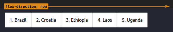
Display elements in a row
.menu {
  display: flex;
  flex-direction: row;
}
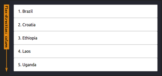
Display elements in a column
.menu {
  display: flex;
  flex-direction: column;
}
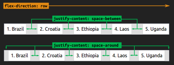
justify-content
Space out elements equally in a row
.menu {
  display: flex;
  flex-direction: row;
  justify-content: space-between; /* OR space-around */
}
Space out elements equally in a column
.menu {
  display: flex;
  flex-direction: column;
  justify-content: space-between; /* OR space-around */
}
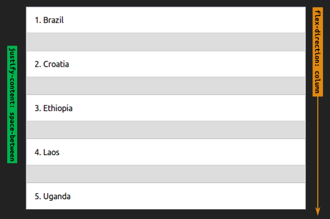
Important: In the above 2 examples we used the same rule (
justify-content: space-between;), but we changed theflex-directionfromrowtocolumn. Notice howjustify-contentworks in the same direction asflex-direction. In the images above, the "green" arrow forjustify-contentis operating in the same direction asflex-direction.
align-items
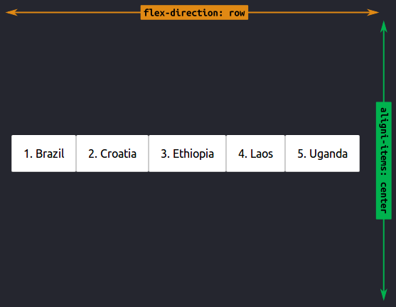
Align elements in a row
.menu {
  display: flex;
  flex-direction: row;
  align-items: center;
}
Align elements on a column
.menu {
  display: flex;
  flex-direction: column;
  align-items: center;
}
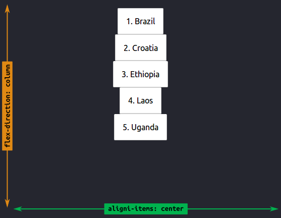
Important: While
justify-contentworks in the same direction asflex-direction,align-itemsworks the opposite way! Have a close look at the above images - the "green" arrow is opposite to the yellowflex-directionone.
Learn more about flexbox by reading this helpful, visual and complete reference to the many properties you can use with flexbox.
Complete exercises 11-17 from the exercise project.
Git Merging
Last week you used Git to create a branch so that you could work on two different copies of your project at the same time.

This week you will learn how to merge your changes in one branch back to your master branch.

Complete exercise 18 from the exercise project.
Resources
Use the following resources to learn more about the topics we covered this week.
Homework
(Est. 1-2 hours) Complete the "Common Responsive Patterns" lesson of the Responsive Web Design Fundamentals course.
(Est. 4 hours) Follow along to as many videos as you can from What the Flexbox?!. You will need to clone this repository and follow each directory that matches the videos.
(Est. 2-4 hours) Return to the HTML/CSS Project you built for homework last week. Complete the instructions under "For Week 2".
Extra Credit
This week you learned how to layout content in CSS with Flexbox. In your work, you may be asked to use other layout techniques, such as CSS Grid, floats, or absolute positioning. Read about CSS Grids, and floats and absolute positioning.
Prepare for the next class
- (Est. 1-2 hours) Next week we will learn how to collect user input. Read about HTML forms and see how much you can understand on your own.