Content Layout: Flexbox
Flexbox is a name for a set of CSS layout rules which are supported in newer browsers. They allow you to apply rules to elements to place them side-by-side and re-arrange them. You just specify how you want your elements arranged and the browser will scale this arrangement depending on the screen size and device used for viewing.
Most flexbox rules are applied to the container, to tell it how to arrange its children. However, there are some rules that can be applied to children as well.
You can see all the rules that can be applied to both the container and the children here: https://css-tricks.com/snippets/css/a-guide-to-flexbox/
Exercise: Continue editing the "Bike for refugees" website by adding 3 boxes below Jumbotron, and using Flexbox, make sure they are arranged like in the sketch below:
If you finish early, you can add some text in each box and position it in the middle of the box.
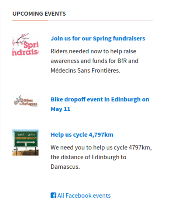
Exercise: Working independently, try to position the articles and images side-by-side under the "Upcoming Events" section. Use this screenshot to guide you. If you get stuck, go ahead and ask your partner. Never be afraid to ask! Hint: you might need to create a container for the text pieces!
Exercise: (Pair programming) Look at this Codepen which uses flexbox. Try to understand how it is working
Often you will need to place a "gutter" between objects that sit side-by-side. A "gutter" is a small amount of open space between two columns. Read about the justify-content property.
Exercise: Add a small gutter between the two articles under the "Learn More" section of the
bikes for refugeeswebsite that you have already forked on your personal Github account.
Read this short article on the align-items property. Try out some of the different properties on your "Learn More" boxes to see how they effect the size of the boxes.
Exercise: The sidebar in your
bikes for refugeessite is broken. Fix it to match this using Flexbox:
